TL;DR
The hero image on our website was stale and generic. Within two days I created a new illustration style, a suite of images, and a new hero animation for the website.

On the Vouchsafe website, we’d always used a simplified shot of the desktop app as the hero image. There were a couple of issues with this:
- Our UI updates rapidly, so the image would become outdated after a few months in place
- We’re more than just the desktop app, and using a screenshot obfuscated our why
- A screenshot isn’t very exciting 🤷♀️
The time came where we needed to update it quickly (in time for an external event, I think?). We didn’t have an illustration style, but this was a startup and I am a generalist, we figure these things out.
So this is how I created an animated hero image over three days.
Monday
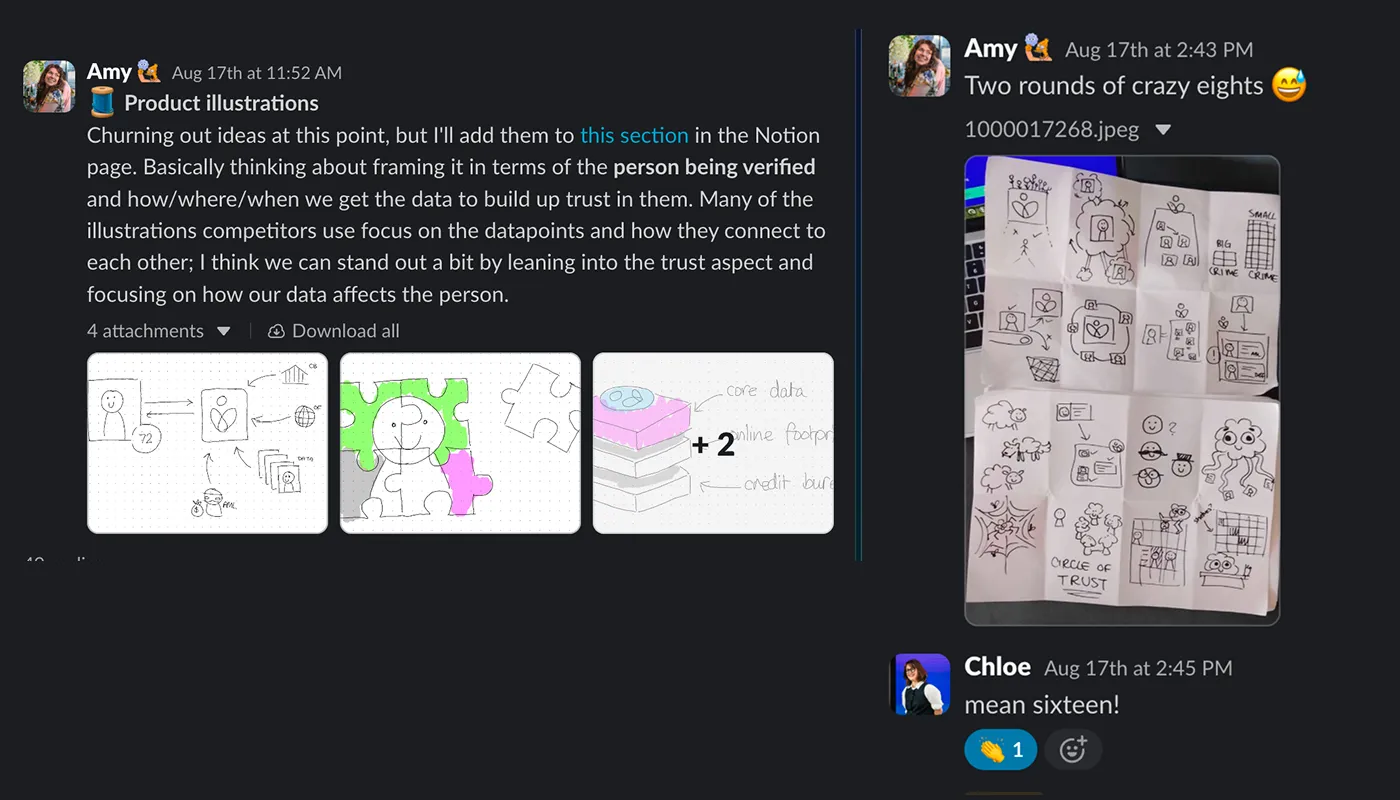
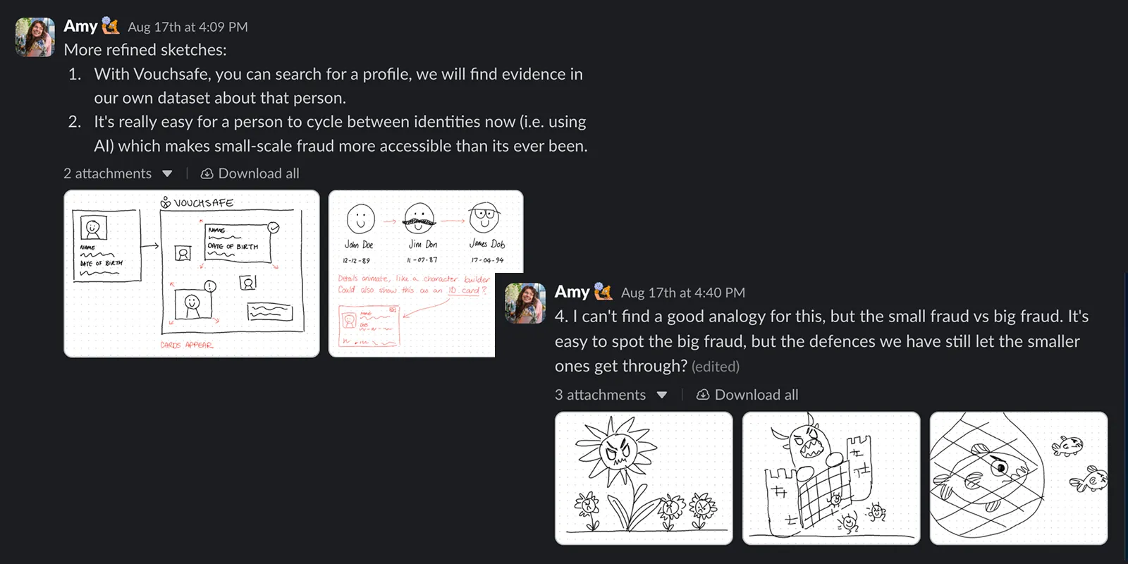
Today was sketching. Trying to understand what we wanted to convey in the image. Did we want something more conceptual, or literal? How complex? Decorative or informative?
Tuesday
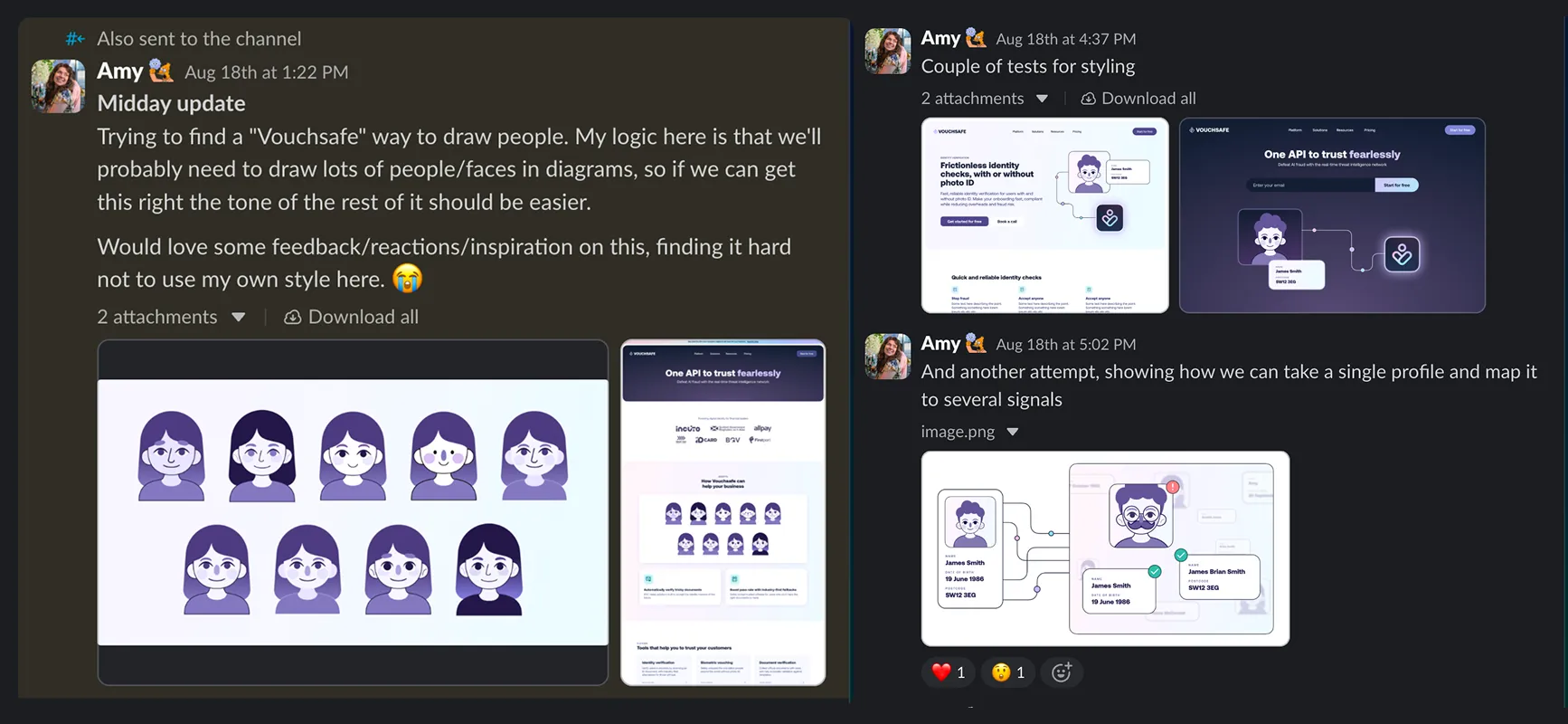
I’d narrowed down what types of illustrations we wanted to share (fewer monsters, more cards and connectors) so I felt confident enough to start rendering.
I spent a lot of today on Pinterest looking at other people’s illustration styles for inspiration. We needed something styled, but not cartoonish, that matched our brand palette.
Wednesday
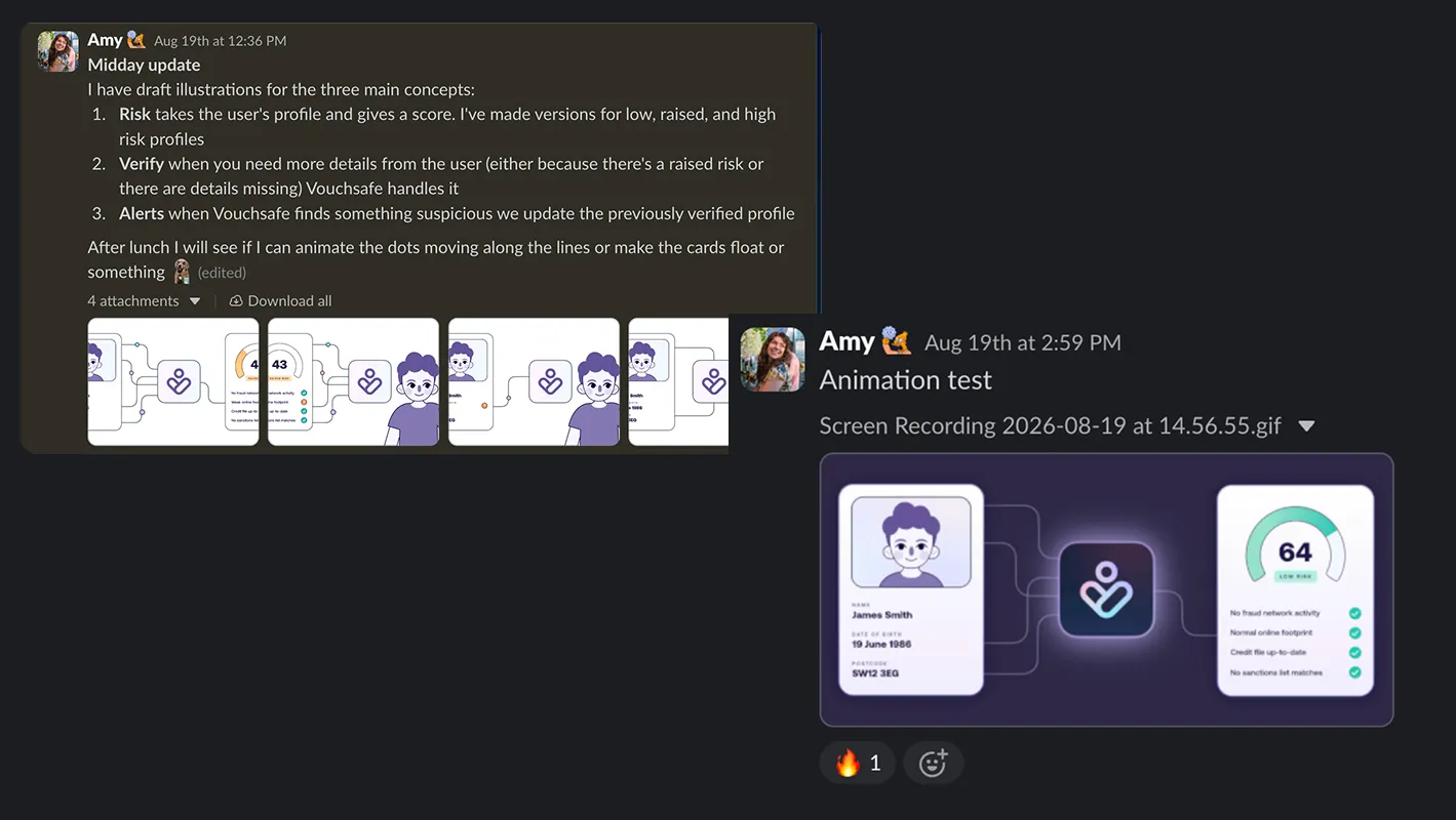
With the visual direction set I could start building out the final illustrations. To go with the hero image I wanted a few alternative options to drop in pitch decks and on social media, so we weren’t just using the same illustration over and over again. I also animated one of them in SVGator.
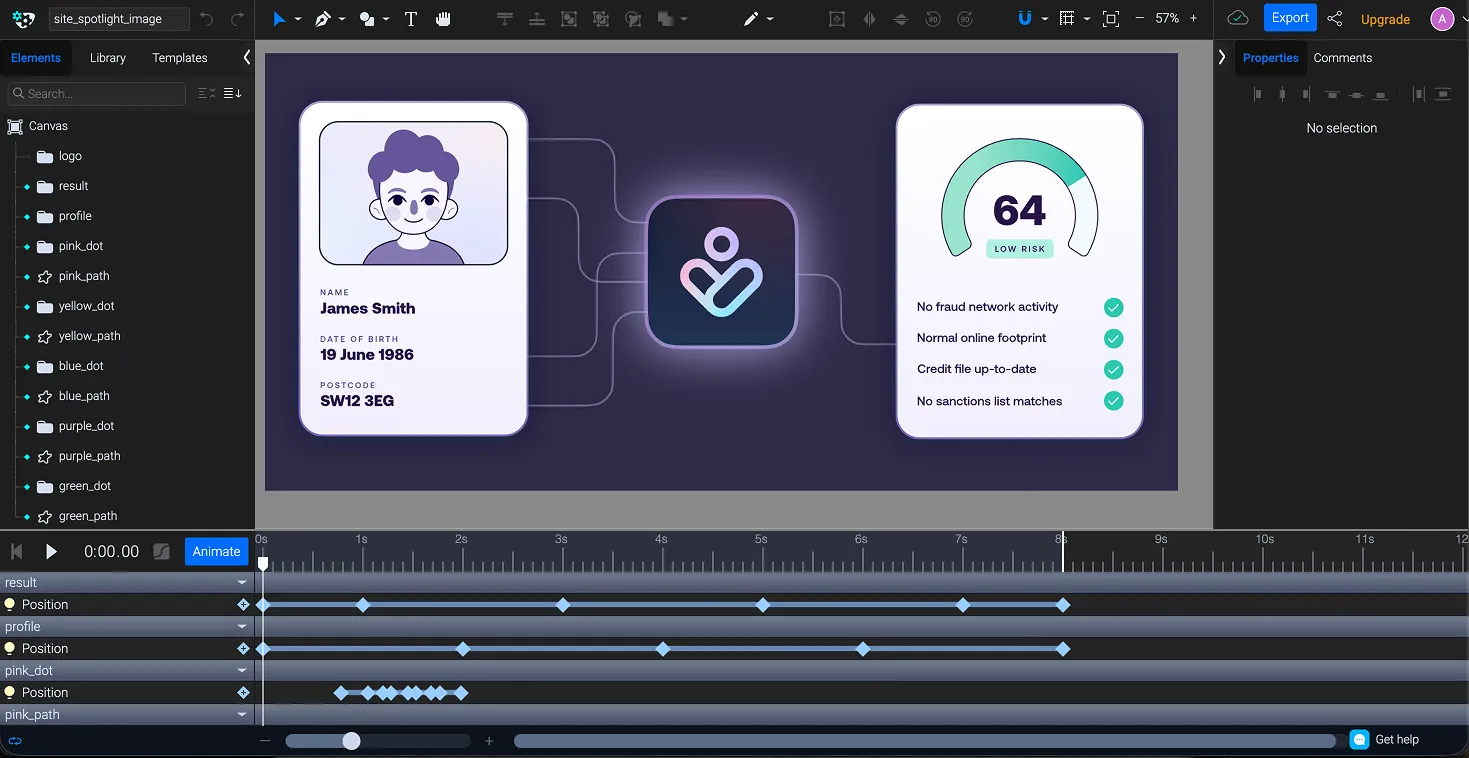
Result
Vouchsafe now has a shiny new hero image, and a visual style that sets the tone for all future illustrations. I also started working on a library of people (so we can show multiple users and not just use the same guy over and over) but this was ultimately put on hold.


